For my double page spread i choose a large image to be on the left hand side of the page as it would attract the readers attention. The subject on the image is looking away from the camera which makes it a good image to use for the contents page as it could give the effect that the subject is looking towards the interview. This invites the audience to look at the article, the sub image looks directly to the audience which once the audience has been invited to read the article it makes them feel involved when they see the sub image.
The image that i had taken was taken as a close up shot because i thought that it would look more appealing on the double page because it is just a simple image and alot of text about the subject. The sub image was taken as a close up shot because it shows the emotion of the subject and also gives direct eye contact so that it makes the readers feel more involved with the article.
The text i have used on the page is Albertus Medium i chose to use this text for my writing because i think it gives of a profesional look and is a text that is easy readable by anyone. I chose to make the sub headings of each interview a different colour this was so the audience would know that the text in red was coming from a different person and the black writing was from the subject on the double page. The representations of the double page is a teenage girl and it shows the girl in a positive light trying to succeed in the music industry. The design of the double page is having one large image on one side and the text on the other which means that you could focus on the image on one side and then focus on the writing on the other rather than looking everywhere at the text.
The software i used to create this double page was microsoft word, i chose to use this software because i think that it gives a professional look and also has alot of tools that helps you create a realistic and creative looking double page. The tools that i used when designing my double page were the shape tools which let me create the arrow in the top right corner, i used this because i thought that it looked effective and like a real double page. I also used the text box tool which let me write all the text in the same size and align, it also let me chose the colour i wanted to have the text and if i wanted have some of the text bold which give it the finishing look.
I chose to have the colour of my text black and red because the house style and colour theme of my magazine were black and red. These colours are also very easy to read and see from a distance. Which makes it more apropraite and practical to chose these colours. The headline was created on the website dafont.com which lets you choose from hundreds of styles to suit your design. I chose this design because i thought that it would stand of the page and give a professional look to the double page.
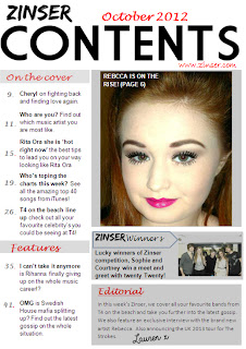
When designing my contents page i researched some real contents pages that is out in the market now and took some ideas to make mine look realistic. The house colour for my contents is black, red, white and grey i chose these colours as it would match the colour scheme on the front page as i wanted the colours replicate it throughout my magazine. I also think the colours work well together and are all clear and could read the information from a distance. The text i used on the contents page varied as i didnt want to keep to the same text as i thought it would be more appealing if they were all a bit different. The subheadings of the information i put in bold so that it would attract the audience attention towards the writing and then the information just normal text. I have chosen to put my headline in big text as it lets the audience know that it is the contents page and its stands off the page. I have placed the text 'october 2012' on top of the contents text as it looks like the text is resting on top of the word.The images i have chosen for my contents page are one large image of the subject of my double page feature , i have made this image the largest on the page as the magazine is based around her on this addition so the image works well on the page. The subject is also looking towards the camera which will make the audience feel involved in the magazine. I have also chosen images of the wanted but made them smaller in the bottom right hand corner, i made them smaller than the other image as it gives the impression that there is going to be a long feature of them as there are two images of them. The design of my contents page is appealing i think it is a good layout as the information goes down the left hand side of the page which focus's all your attention down the side of the page instead of information being spread all out the page. I think the layout of the large image is good as it breaks up the page and makes you focus on one thing each time rather than all over the page.
The software that i used to create my contents page was microsoft word i used this because it has all the tools on that i need to create my contents page. The software is also very easy to work with which would make it easier to work with the contents page. With microsoft word you can use a shape tool which let me create a box so that i could place it over the subheadings which would make it look more professional. The colour was too solid so i used the tool that would format the shape so that i could make the box colour more transparent to make it look effective. Also i used the text box tool so that i could add my text on the contents page. I used the bold tool to make some of the text stand out such as the subheadings so that they would look more effective and draw the readers attention towards what the subheadings are saying.
The colours and text style i have used on my contents page are similar to the front page as i wanted to keep the same colour scheme throughout my magazine. The red black and grey work well together and are colours that can be easily seen and read. The colours that i have chosen on my colour scheme were black, red and grey. I chose these because of the representations these colours give, the red connotes love and feelings however the black represents danger, which could give the effect to the audience that the subject is a loveable person but could be dangerous if you get in her way of what she wants to atchieve. Ive made the headline the biggest text so that it is the most noticable so that it will draw the readers attention towards the page. The text down the side of the page is in black so that the readers can focus directly to it but i have also divided the text up by putting the important parts in bold so it will draw the attention from the readers. I also used the website dafont to create the text 'lauren' in the editoral section as it looks that i have wrote it and gives a realistic look.
The improvements that i have made to my contents page are i have made the main image alot smaller because it was too large and took up alot of room where more information could have been added. I didnt really like the sub images i had on my first draft of the wanted so i decided to change the image to my friends that i took when they got to meet twenty twenty as i could add more text about this photo and make it more realistic than the other images. I added a zinser winner section where i could add information and a image of a competition winner which makes my contents page look more professional and practical. I have also added an editoral because in some of the contents pages i anaylised it had an editoral section which i think looks engaging to the audience because they can get to read a little paragraph of what the editor of the magazine has wrote.

