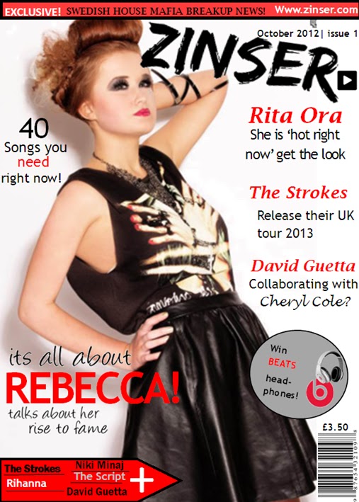
This is my final page design, i have changed a few things since my first attempt as i have changed some of the fonts as i thought it looked better having all of the text the same font and style as i didnt think it looked very good or appealing when all of the fonts where different. I have also changed the wording in some of the text from the first design as i think the phrases in the new design are more interesting than the other as i am using real celebrities rather than making up my own. I have also deleted the quotation that was in the bottom right hand corner as i didnt think it worked well on the page and it was also not clear enough to know who had said the quote as it was not next to the text about rebecca. The text of 'its all about' and 'talks about her rise to fame' have been changed as on my first design i used just normal Microsoft word fonts and i didnt think they attracted any attention as they were plain and boring, however i went onto the internet on a website called www.dafont.com and found some fonts that were more suitable and appealing for the front of the magazine and audience.
I had also changed the wording that was in the bar at the top of the page as i thought i should put something that would interest the readers rather than the date and price of the magazine. I think it now looks more appropriate for the magazine as it will interest the readers more now that there is something that will draw them in.
In my final design i decided to change the position of my price and barcode, i didnt think it worked well where it was so i decided to move it to the bottom right hand corner because alot of magazines use there barcodes in that position. I moved the price to underneath the barcode as i think that is the most suitable place to have the price as it a noticeable place for the price to be and also with the price being next to the barcode it relates to each other so it is better for the audience and the seller. I also changed the price of my magazine because i thought that £1.50 was too cheap for a magazine, so i decided to change it to £3.50. I moved the date and issue number above my Masthead as i think it is a good position to have it as when people are reading the masthead they will look just above and see the date of the magazine.
I havent changed the masthead position or my plug because i think they are in the right place and i think they look effective and appealing and will attract readers attention to buy the magazine. I like the plug i have put on my front page as it will draw attention from the readers that there is something on offer so it will have more popularity.
I have chosen the colour scheme to be red, black, grey and white as all of the colours work well together as they stand out from each other and give an impact of the page.The colours are also very clear to read. I have used the colour scheme all throughout the magazine because i thought replicating the scheme would brand the colours of the magazine and the readers will remember the colours of the magazine. I have put the made up website on the top on the page to make the magazine look more real.
No comments:
Post a Comment