How does my magazine use, develop or challenge forms and conventions of real media magazines?
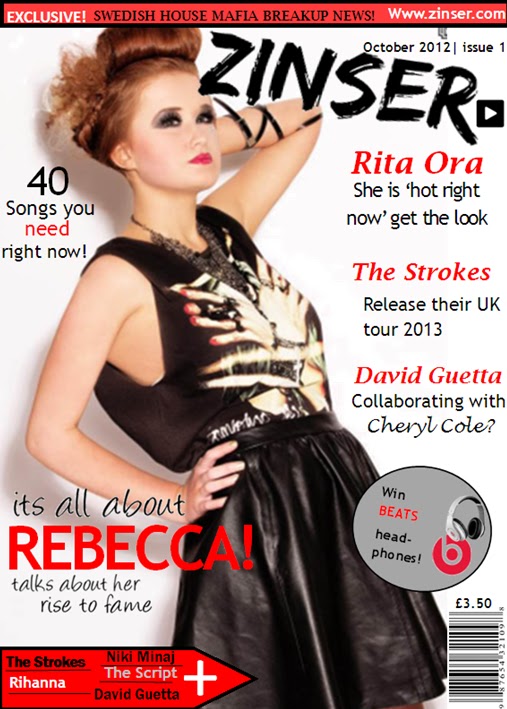
my magazine has interpreted some of the same designs and features from real magazine front covers, contents and double page spreads as I have analysed different magazines and took some ideas from the different magazines I have looked at. This was so that the magazine I was designing had realism and looked like a professional magazine. For the front cover of my magazine I have used a strong main image which would suit the target audience. It also suited the real media productions because of the good quality and strong influential image. The masthead has strong connotations with the image because the masthead is funky, strong and eye catching just in the same way the subject is portrayed in the image. When I researched double page spreads I noticed that quite a lot of them had quotes which I thought looked effective so for my double page I decided to add a quote in to produce the more professional logo. When looking at contents pages I noticed that all of them had columns for their text to go in, for my contents page I put my text in columns but I didn't’ do the usual design I chose to put the text down the left hand size so the audience would focus their attention just down one side of the page rather than the text being scattered around the page. Whilst analysing front covers I noticed that a lot of magazines used plugs as they attract the audience attention because they recognize the symbol that there is free gifts inside. So in the process of designing my front page I added a plug to the page, this was to give the more appealing look to the front page.
How did you attract/address your audience?
The masthead of my front page attracts the audience because it is a big and bold which would catch the readers attention. The style of the masthead is also quite funky and has a bit of a rock style which draw the readers attention straight towards the masthead and would not forget the name of the magazine that easily. Mise en scene of my images are all different on each page. For the front of magazine i chosen my image to be the most powerful because it will stand out on the front and make readers look at the image. I took this image from a medium shot so that i could get most of the girl in the photo and could see her face and her fashion which could espire some of the teenage girls who read the magazine to copy her fashion. However i didnt take it from a long shot because i thought that it would have been less effective because the detail of the girl such as her makeup and hair wouldnt have been as noticable. The costume of the girl was rock chick portrayed her looking powerful and strong because of the clothes she was wearing. It made the girl look like she was dominant. It reflects the genre of the magazine because the magazine is a indie rock style which shows from the image of the girl. Throughout the magazine i didnt tend to just stick to one type of font style i used all different fonts because i thought that just sticking to just one font style all the way through would be quite boring so i used different ones from franklin gothic,Trebuchet, arial and Albertus Medium which were used in the front, contents and double page. I also used fonts from the website dafont.com, this website allows you to choose from loads of different fonts that suit your design. The reason i chose the fonts i did was because i thought they all went well together and made the pages look effective and stand out. The suited the audience well because they werent plain and boring for teenages they were impressive and practical. My magazine attracts the audience because of the representations as it shows a teenage girl in a positive light trying to get some where in her career in the music industry, this could make people want to read about her and the interview she is giving. The colours on my magazine are good appealing colours that make the magazine look realistic. The colours I have used are black, red grey and white which are all very powerful colour and are dark which makes the colours catch your attention and makes you focus directly towards the front page by the eye catching colours. The age the magazine is aimed at is teenagers 13-19 as it has information about people that are in the charts now that are giving interviews. It gives out a lot of music information which teenagers are involved in at the moment such as the top 40 songs and what new releases will be coming out. This would attract the audience as they will be wanting to know what new music will be coming out that they can download. The price of my magazine could Attract the audience as it is priced to meet the needs of the audience, the magazine is very well priced and affordable, which also gives away free gifts which cost a lot of money in the shops. The images on my magazine could also attract the audience as I have used a lot of strong images of an attractive young female, the image on the front page is strong because the representations of the girl posing is that she is communicating with the audience and making them feel involved in the magazine and also it is a long shot of the female which shows of her fashion and could be a fashion icon.
What kind of media institution may distribute your magazine and why?
If I was choosing what media institution I would like to distribute my magazine I would choose IPC media because they sell a range of different magazines which are popular and they are appropriate to the target audience, there magazines are also very successful. IPC media also specialize in music magazines as they distribute music magazines such as NME and uncut. IPC media music magazine ‘NME’ is very popular 1.1 million fans buys this magazine every week. I think that my magazine would fit in with NME and the music magazine category and become a successful magazine if IPC were to distribute it. I think that if IPC can produce such a big selling music magazine base then they would be able to distribute my magazine which is another music magazine. As my magazine has a slightly different genre base to NME and uncut, I think that there would be a lot of interest in ‘Zinser’ because the readers would have a variety of styles to choose from.
How does my magazine represent particular social groups?
My magazine mostly represents females, the female that are featured in my magazine is a teenager and the images are showing the females in a positive light and that they are trying to succeed in her career. This is going against the usual stereotypical teenagers as they are usually shown off in a negative way. It shows that girl is powerful and is willing to do whatever it takes to achieve her success in her career.
The female image is showing of her fashion which could draw teenage girl’s attention to copy the fashion and be inspired by the subject. The image is also an attractive image of the female which could capture the male attention who is mostly the secondary audience as they may want to look at more images and carry on through the magazine. The magazine mostly features females throughout the magazine which could be good for both male and female audience as the female audience could be inspired by the fashion of the girl subjects. The male audience attention could be captured by the strong appealing images of the girls.
Who would be the audience for my magazine?
Audience code
A-doctors/professionals
B-teachers/police
C1-office workers
C2- plumbers/electricians
D-minimum wage
E-students/pensioners/unemployed
The audience that would be for my magazine would be c1 downwards as the target audience age is 13-25 which mostly would be in them category's, which would be the primary audience with mostly females and some males. People that is lower paid than the others are more likely to buy the magazine rather than the higher class such as audience code A and B. The percentage of people who read this magazine would be mostly females over males as the primary audience is women.
What have you learnt about technologies from the process of constructing this product?
When designing my magazine I have learned how to use different software's and technology during the process of my magazine. When editing my photos for my magazine I used a software called Photoshop that improved my photos when I edited them, I also used a cutting tool on Photoshop that cut around the photo I was using which cut all of the background out and made the subject of the image stand out rather than having her on a background. It made the image that I was editing more professional without having a background on the image so that I could put it on my double page.
Another Software I used was publisher to design the front page of my magazine, this gave me a lot of tools to use that would make my magazine look professional. The tools on publisher were a lot easier and straight forward to use than adobe Photoshop. The tool that was the most useful was the tool that let you move and resize your images and text, this was useful because it let you move your image or text wherever you wanted to place them whether it was next to the text or further away from it. The shape tool was also very useful as I used this tool to help create my boxes, arrows, plug and a lot more things. I could also format the shape so that I could change the colour and transparency of the shape. The text tools were good in helping me create a professional looking front page as they let you change the colour of your text and also make it bold and italic.
I also used Microsoft word to create my contents page and double page feature as this program have good word art that would work well on the pages to make them look appealing and eye catching.
The last software I used was an online website called www.dafont.com which gives you a lot of choices on which style of fonts you want to use. The style of fonts I used was handwriting because I liked the style for my front page and also my double page. For my masthead I used the style called brush because it give a big bold effect which was perfect for my masthead as it would be striking for the audience and catch the reader’s attention. I replicate the masthead symbol throughout my magazine.
Looking back at my preliminary task, what do i feel you have learnt in the progression from it to the full product?

When looking back at my preliminary task to my magazine product now I think that I have improved a lot. I found out new ways to make my images effective with good effects used by publisher. When designing my front page for my magazine I looked and analysed some real magazines which made gave me ideas for my magazine that made it look a lot better than my preliminary task. when looking back to my preliminary task i feel as though my front page has improved a lot and has a more professional and real look as the preliminary task wasn't that effective. There is a more professional look with the final design as it uses some of the actual ideas what a real magazine would use, such as a plug, subheadings, bar code and the price of the magazine. On my preliminary task i didnt use any of those which gives the most effective view on my final front page. The image that i used on my final front cover is very powerful and effective which will make the readers look directly at the image and draw their attention to buy my magazine, however i dont think that the image on the preliminary task was very effective and wouldn't draw attention from the audience.


