Wednesday 12 December 2012


For my double page spread i choose a large image to be on the left hand side of the page as it would attract the readers attention. The subject on the image is looking away from the camera which makes it a good image to use for the contents page as it could give the effect that the subject is looking towards the interview. This invites the audience to look at the article, the sub image looks directly to the audience which once the audience has been invited to read the article it makes them feel involved when they see the sub image.
The image that i had taken was taken as a close up shot because i thought that it would look more appealing on the double page because it is just a simple image and alot of text about the subject. The sub image was taken as a close up shot because it shows the emotion of the subject and also gives direct eye contact so that it makes the readers feel more involved with the article.
The text i have used on the page is Albertus Medium i chose to use this text for my writing because i think it gives of a profesional look and is a text that is easy readable by anyone. I chose to make the sub headings of each interview a different colour this was so the audience would know that the text in red was coming from a different person and the black writing was from the subject on the double page. The representations of the double page is a teenage girl and it shows the girl in a positive light trying to succeed in the music industry. The design of the double page is having one large image on one side and the text on the other which means that you could focus on the image on one side and then focus on the writing on the other rather than looking everywhere at the text.

The software i used to create this double page was microsoft word, i chose to use this software because i think that it gives a professional look and also has alot of tools that helps you create a realistic and creative looking double page. The tools that i used when designing my double page were the shape tools which let me create the arrow in the top right corner, i used this because i thought that it looked effective and like a real double page. I also used the text box tool which let me write all the text in the same size and align, it also let me chose the colour i wanted to have the text and if i wanted have some of the text bold which give it the finishing look.

I chose to have the colour of my text black and red because the house style and colour theme of my magazine were black and red. These colours are also very easy to read and see from a distance. Which makes it more apropraite and practical to chose these colours. The headline was created on the website dafont.com which lets you choose from hundreds of styles to suit your design. I chose this design because i thought that it would stand of the page and give a professional look to the double page.

contents review


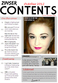
 When designing my contents page i researched some real contents pages that is out in the market now and took some ideas to make mine look realistic. The house colour for my contents is black, red, white and grey i chose these colours as it would match the colour scheme on the front page as i wanted the colours replicate it throughout my magazine. I also think the colours work well together and are all clear and could read the information from a distance. The text i used on the contents page varied as i didnt want to keep to the same text as i thought it would be more appealing if they were all a bit different. The subheadings of the information i put in bold so that it would attract the audience attention towards the writing and then the information just normal text. I have chosen to put my headline in big text as it lets the audience know that it is the contents page and its stands off the page. I have placed the text 'october 2012' on top of the contents text as it looks like the text is resting on top of the word.The images i have chosen for my contents page are one large image of the subject of my double page feature , i have made this image the largest on the page as the magazine is based around her on this addition so the image works well on the page. The subject is also looking towards the camera which will make the audience feel involved in the magazine. I have also chosen images of the wanted but made them smaller in the bottom right hand corner, i made them smaller than the other image as it gives the impression that there is going to be a long feature of them as there are two images of them. The design of my contents page is appealing i think it is a good layout as the information goes down the left hand side of the page which focus's all your attention down the side of the page instead of information being spread all out the page. I think the layout of the large image is good as it breaks up the page and makes you focus on one thing each time rather than all over the page.

The software that i used to create my contents page was microsoft word i used this because it has all the tools on that i need to create my contents page. The software is also very easy to work with which would make it easier to work with the contents page. With microsoft word you can use a shape tool which let me create a box so that i could place it over the subheadings which would make it look more professional. The colour was too solid so i used the tool that would format the shape so that i could make the box colour more transparent to make it look effective. Also i used the text box tool so that i could add my text on the contents page. I used the bold tool to make some of the text stand out such as the subheadings so that they would look more effective and draw the readers attention towards what the subheadings are saying.

The colours and text style i have used on my contents page are similar to the front page as i wanted to keep the same colour scheme throughout my magazine. The red black and grey work well together and are colours that can be easily seen and read. The colours that i have chosen on my colour scheme were black, red and grey. I chose these because of the representations these colours give, the red connotes love and feelings however the black represents danger, which could give the effect to the audience that the subject is a loveable person but could be dangerous if you get in her way of what she wants to atchieve. Ive made the headline the biggest text so that it is the most noticable so that it will draw the readers attention towards the page. The text down the side of the page is in black so that the readers can focus directly to it but i have also divided the text up by putting the important parts in bold so it will draw the attention from the readers. I also used the website dafont to create the text 'lauren' in the editoral section as it looks that i have wrote it and gives a realistic look. 

The improvements that i have made to my contents page are i have made the main image alot smaller because it was too large and took up alot of room where more information could have been added. I didnt really like the sub images i had on my first draft of the wanted so i decided to change the image to my friends that i took when they got to meet twenty twenty as i could add more text about this photo and make it more realistic than the other images. I added a zinser winner section where i could add information and a image of a competition winner which makes my contents page look more professional and practical. I have also added an editoral because in some of the contents pages i anaylised it had an editoral section which i think looks engaging to the audience because they can get to read a little paragraph of what the editor of the magazine has wrote.

Thursday 22 November 2012

preparation of magazine.


When preparing for my magazine I had to decide on a name for my magazine. I chose the name ‘Zinser’ as the name because I thought it was the name was quite catchy and quirky to use. The name Zinser is a very popular word but I think that it appeals to the magazine very well as I think it is a good name for a magazine as there aren’t a lot of magazines begin with the letter Z and also it isn’t easily forgotten. The price that I have chosen my magazine to be is £3.50 as I think that is a very reasonable price for a magazine and affordable as you find out the best gossip and music details within the magazine as well as it giving away free items in nearly every addition. There are also a lot of offers that could win you great prizes, so it is worth the price you pay for the magazine. Some magazines in the shops range from 2 pound and upwards without any free items so I think that the price I have chosen is a good price for my magazine. The representations of my magazine is teenage girls as the images on my magazine is of an teenage girl, it shows the girls in a positive light and how they have succeeded in the music industry. Unlike the media, as they are mostly stereotyped of being bad youth and connoted as not being as successful in now a day life. The images that I have put on my magazine are of a teenage girl, the front page image gives of a powerful effect as it portrays the subject as being a powerful person from the pose she is doing and also the shot type is a medium shot which gets most of her body in as you can see her body language and the clothing. The double page image is a close up shot and can only see the subjects face however she is looking to the side so it looks like she is looking towards the interview she is giving. The contents page image is also a close up shot but the subject is looking directly at the camera so it makes the audience feel involved. The audience of my magazine would probably be teenagers as I think teenagers are very involved in music gossip and like to know a lot about what is new like up coming chart music and what is out now in the top 40. The gender of my magazine would most likely be females as it shows a lot of images of females so this could make the females feel more involved with the magazine rather than males which would make them the primary audience. The males would be the secondary audience, as they might like the artist who is the main feature that week and could like the images. They could also like to read about the music gossip as the music information inside can be unisex so it would attract both genders. The age the magazine is aimed at is 13-21. 

Friday 16 November 2012

editing of image

For my contents page image i edited it on microsoft word and also windows photo gallery, i done this to make the image stand out more on my contents page. when i was using windows photo gallery i changed the contrast and brightness on it as it gave me a more proffessional look and effect towards the image. I only brightened the image up a little on the scale because i didnt want the image to be too bright, i also only moved the contast scale a little aswell as i was going to add another effect on microsoft word. When editing my photo on microsoft word i double clicked on the image so that the colour icon would appear, i then chose the effect 'colour tone' which gave the image a bit more colour to it. I liked the image after finishing using the effects and now the second image is my final image for my contents page.

annotation of contents page 3

first design of double page


This is my first design of my double page, to create this the software i have used is microsoft word.

When making my double page i used microsoft word, i chose this program because it is a easy software to use and it also lets you create a professional design in a simple way. I like the tools on word because it lets you move and resize your images and text around with ease. I also used the shape tool to create the arrow at the top so that i could add text 'zinser cover' to make the double page look realistic and proficient. I used the tool formating shape so that i could change the colour of the box to solid fill to no fill. The text tool is good to create a worthy design to make the double page look good. It lets you change the colour of your text and also what align you would want your text to be in. The bold tool makes the text you choose to stand out from the rest of the text. To move my image to the left hand side of the page i used a tool called wrap text, then i clicked on square so that i could move the image around without it wraping around the text. I also used the software adobe photoshop to edit my image. I used the cutting tool so that i could cut around the image so that it didnt have the background on my double page.

I chose this image to be on my double page because i think that it creates a possitive representation of the subject because she is posing but it gives of the impression that they are serious about her new career. The shot that i have used for this image is a close up shot because it captures the subjects emotion in the image which could give of representations that she is passionate about doing well and that nothing is going to stop her atchieving her goals. I also took the subjects photo on the side so that when i uploaded it to my double page it would look like the subject was facing the interview.

The colours i have used in my double page are the same colour scheme throughout my magazine. I have divided the colours up in my text so that the sub headings are in red and the text is black. I thought that this made the page look more professional becaause it lets the readers know where to look first and breaks down all the text to look at. The headline is also black because i think that it gives impact and draws your attention straight towards it.

To improve my double page i am going to make it more appealing because i dont think that it has alot of features on the page that makes it look like a real double page feature. I am going to add the page number at the bottom of the left hand page so that it gives the effect of realism. I am also going to add a quote in the text because i think that every good double page feature has a quote so i am going to add one where there is space.

first design contents page


This is my first design of my contents page, i created this design on microsoft word.

When making my contents page i used the software microsoft word because it is a software that is easy to use and can create my contents page in a professional way. In word it is easy to resize and move your images and text. You can also wrap text around your images to make it easier for you to move your images around the text or next to the text. With word i can also use the text box to create my text for the contents page and also decide wich align i would want to choose for my text to be in. I also made some of my text bold and italic so that it would give it more of a professional look to the text. The text on my contents page is very clear to read as the style of the font i have used is easily readable and also it is positioned in places where it is clear to read for an example the subheadings are in bold and the text underneath is just normal. Another tool that i used in word was the shape tool which helped me to create the rectangular boxes over the headings of each text. With these shaped i could change the colours of them by formating the shape which let me also make the box transparent. I made the boxes transparent so that the boxes werent bright grey and could also see the text that was underneath it.

I have chosen these images to go on my contents page because i think that the main image of the subject is striking and also eye catching. This image is also a positive representation as she looks important and successful and shows that she is just a down to earth person. The primary audience for my magazine are teenagers (13-25) who may see the girl in the image to be inspiring and a role model.The subject in the image is looking directly towards the audience which could make the readers feel more involved with the subject. When i took this image i decided that i was going to do a close up shot because i thought that it would show the emotion and happiness of the girl with the success in her career and show her of in a possitive light. The sub images are what i took at the wanted concert which are taken from a long shot to show all of the members in the group, it could show representations that the group are strong and connected.

The colours that are used in the contents page are the same colours from my front page because i wanted to stick to a certain colour scheme because i think that the colours will represent the zinser magazine and will be appealing. Also i think that all the colours work well together and have a strong impact on the page because of the colour choice. Im going to replicate the colour scheme throughout the whole magazine. I also think that the colours red and black have strong connotations, the colour red could be seen as the colour of love and the black could represent danger which could overall mean that she is a loveable person but could also be dangerous in getting what she wanted to atchieve.

To improve my contents page i think that im going to resize the main image smaller because i think that it is too large and could add more pieces of information in place of the large image. I am going to add a editoral on the page because i think it makes the page look more professional.


Thursday 15 November 2012

3 original images

These are my 3 main images that i have used for my front page, contents page and double page spread. I have chosen these images because i think each one of them are very appealing and attractive which would draw the reader attention towards each of the pages i am using them for. The third image is used on my front page, i have chosen that image to be on the front because i think it is a really good image and it is a good medium shot that shows most of the subject so it will be be a good shot to have on the front as it will draw the reader attention, it also shows on the clothing the image is wearing so it could give fashion inspiration for the readers.
The first image i have chosen for my contents page because the subject it looking directly towards the camera which makes the audience feel involved with the person. It is also a clear and appealing photo so it will hopefully stand out against the contents page. The image is also a close up shot which shows the subject very close to her face, this could give makeup ideas to the readers.
 The second photo i have chosen to use this image on the double page spread because the subject is looking towards the text on the double page which gives the effect that the subject is looking at the interview that she has given. This is a good effect because it makes the readers feel that she is also interested in her story as well as everyone else. The image is a close up shot which shows her face very closely but in a different way as she is looking to the side to look towards the text.

Wednesday 14 November 2012

flat plan of double page spread


This is the flat plan of my double page spread, i have chose to design the page like this because i think it will look effective when it is finished by using a large image on one section of the page and then filling the other section with text from the music artist.

flat plan of contents page


This is the flat plan of what i would like my contents page to look like,  i have took some ideas from other contents pages and put it all together on my flat plan to make it hopefully look like my real contents page.

flat plan of front page

This is the flat plan of what i would like my front page of my magazine to look like when i have completed it, i have designed the flat plan the way i think it would look good for when i have eventually finished. I have annotated the flat plan so that i remember what specific ideas i would like to put on the front page.

annotation double page 3


Friday 9 November 2012

first design of magazine front


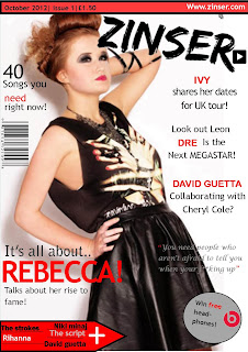
To create my front cover the software i used was microsoft publisher, this software allows you to design and create banners, certificates, flyers and alot more. There are alot of tools that i used on publisher to give my front page a professional look.I used the picture tool where you could wrap the text which meant that i could move the image round to where ever i needed to on the page with ease. I also used the recolour tool which i could click on to change my image to transparent that made the background clear so that i could have just my image on the white background. The plug on my front page was created by the shape tool where i could make a circle shape, i could change the colour of the shape by formatting it so i could have it the colour to match my colour scheme. If i needed to change the shape the tools on publisher make it much easier to use as you can resize and move it about.

For my front page i have chosen to use the colours black red and grey because i think that these colours work well together and give of a strong connoation as the red and black colour represent the colours of danger. I think that it also portrays the subject in the image to being powerful and dangerous aswell. I want to keep these colours throughout my magazine and have these colours as my house style. The text that i have used on my front page are quite big and bold so that it grabs the readers attention to my front page. Ive used the masthead in a big font and also the text 'rebecca' because i think that these are important text for the front page. The text 'rebecca' indicates that the main feature is going to be about someone called rebecca. Also with the text on the page i have used the text that i want to stand out in a different colour to the other text because i think that it will draw the readers attention towards the text.

For the main image on the front page i tried to give a representation of a powerful and strong girl by the pose that the subject is doing. It shows that they are serious about the whole music career and gives of representations that she will be successful from the passion she has for her music career. The image is also looking up towards the masthead which gives an effect that she is looking up to her music career. The image is also of a young attractive female that will draw the secondry audiences attention who are male, the image may make the audience buy the magazine and read on. The primary audience may be inspired by the subject as a strong women. The image for my front page is eye catching and very appealing as it is a strong and influential image that would capture the readers attention towards the magazine to buy it. I took this image in a room with white walls so that it would look like the subject was in an actual photo studio and so i could edit the image to make the background white. I took a medium shot of the subject because i think that it was the perfect shot to use because you can see the detail of the subjects makeup, hair and clothing which could inspire some girls of the same fashion.

To improve my front page i am going to change some of the text fonts so that i have a variety of different fonts, im also going to resize some of the fonts to make them bigger to fill in more of the front page. Im also going to add more text in the headline box at the top of the page. I dont think that im going to keep the quote on the front page because i dont think that it is very appealing and would look better without it.

annotation of contents page 2

annotation of contents page

Thursday 18 October 2012

magazine introduction

The name of my magazine is called zinser, i chose this name because it is an unusual name for a magazine and also there are a lack of magazines with the letter begining with a 'Z' in the magazine industry. I also chose the name zinser because i think it is a catchy word and i dont think it would be forgotten easily. The name of my magazine doesnt have any connotations as the word zinser doesnt actually have a meaning however i think it just comes across as a new and catchy word.
The genre of my magazine is pop/rock because it is the most popular genre in the music buisness at the moment, it is also very mainstream that most people enjoy that kind of music.It appeals to alot of different audiences and could have very high sales levels.
The images i have chosen to put on my magazine are images of my friends that give of a strong pose and features which will draw the readers attention towards the image. My images also all have different shot types as the front cover image is a medium long shot.
The primary audience of my magazine will be teenages from 13-19 as they will take interest in the artists and style., the primary audience will be aimed at gender which will be mostly females that buy the magazine as they will be reading about the lastest gossip and looking at the images and taking in ideas of the fashion of the models.The secondry audience will be anyone that are interested in the articles and the music. Also males maybe interested in the images from the articles.

Friday 12 October 2012

magazine fonts


These are some of the fonts that i have chosen for my posible masthead for my magazine. I created these designs on a website called dafont. This website lets you create fonts on which ever style you chose from. The style i chose to create these fonts was the brush style as it gives a messy looking look for the masthead but also big and bold and stands of the page which i think looks very attractive and appealing to the target audience. The style looks a bit rocky which matches one of the genre of the magazine. I have chosen the masthead to be black because i think that the colour is very noticable and easily read,however i also think that representations of the colour black is powerful which i would like my magazine to come across as.

Sunday 30 September 2012

contents page


To create my contents page I used Microsoft publisher, I chose to use this software because I find it quite straight forward to use and it has all the tools I need to design a good magazine. To design my contents page I duplicated the page from the front cover so I would have the same background design on the magazine as I would like the theme for the magazine to be repetitive. I also used the text tool so I could add the text to the contents page, I also used a colouring tool so that I could colour the background in white to make the text stand out from the background but when I had done it the white stood out a bit too much so I used the transparent tool to make it just the right colour. For the heading of the page used a website called dafont as it has good font style designs so I used it to get a good font style for the page to make it stand out. I also put a background border behind the text to give the heading a bit more of an effect of the page.

Thursday 27 September 2012

what do i expect to see in a school magazine?

what do i expect to see in a school magazine?

In a school magazine i would expect to see some information about the school and what happens during school days, such as school trips and school interviews with staff and pupils to show the interest of everyone. Also a lot of information for the parents to read about which may be useful to them for the future. For an example times and dates of holidays, school trips and school activities that they can get involved in.
The language in the should be suitable for everyone that reads the magazine so it should be informal because it connects with the audience. It should inform us about all the people that have contributed to the magazine so we can find out whos intrests are in media and why they enjoy making the magazine. Also a wide range of people from staff to pupils to parents contributing information in the magazine so everyone will have the interest of reading inside the magazine instead of throwing it away. On the front of the magazine i would expect apealing images to catch the audiences attention to read the magazine because if there were boring images people may not fancy reading it. I would also expect the most important news on the front about the school or whats happening so that it attracts people to read the magazine.


front page


To create my front page i used microsoft publisher, i used this software because i tried photoshop and found it difficult to use as it was hard to enlarge pictures, however i used the lasso tool to cut out the picture for the main front image and also used the brightener tool to make the picture stand out. for my background i used an image from google and then replicated it on the page so that it would cover the whole of the page. In publisher i used the recolour and picture styles tools by changing the design of the picture into different shapes to give different effects. I also used a online website to design my headline, the website was called dafont.